Lipogram

Thinkbase allows people to visually explore the relationships that Freebase can expose. Thinkbase employs the Thinkmap visualization software to visually represent the semantic relationships between objects on Freebase as an interactive mind map. Each object on the map is represented by an icon that corresponds to the type of object it is. For example, person, place, movie, song, or artwork.
The site uses a two-pane display, putting the relationship map in the left pane, and the Freebase entry for the active node in the right pane. Every node on a Thinkbase map and be expanded to see concepts related to that object, or collapsed to clean the graph of relationships you're unconcerned with. Every map you create can also be linked to via a dynamic share URL.
 Thinkbase is a usefull visual front end to the Freebase database that exposes the semantic relationships that such a database can reveal in a compelling way. Tools like Thinkbase can help us start to think about what type of questions we should be asking by clearly showing the type of semantic relationships that databases like Freebase excel at finding.
 Christian Behrens an MSc candidate of the Potsdam University of Applied Sciences (Interface Design programme) developed a useful website as a guide to Information Design Patterns.
 They amaze me every time by their designer craftsmanship and ability to visually capture the concept of a solution without becoming overly technical...
I'd certainly would like to put them to the head slapping test of capturing my usually more than one minute elevator speech in an image that fits the back of my business card !
Compare the following 4 maps: worldmap, container ports, nuclear power and aircraft flights.
Land area
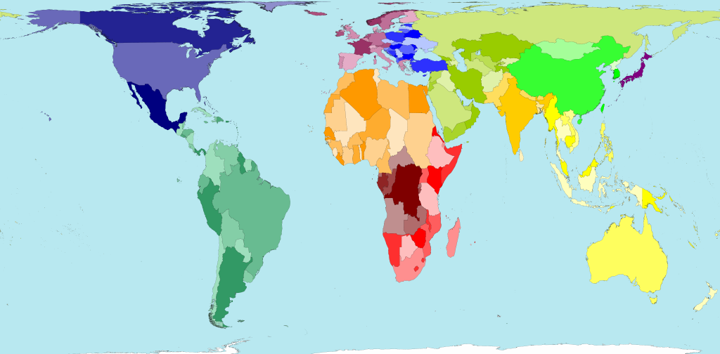 The total land area of these 200 territories is 13,056 million hectares. Divided up equally that would be 2.1 hectares for each person. A hectare is 100 metres by 100 metres.
Container ports
The total land area of these 200 territories is 13,056 million hectares. Divided up equally that would be 2.1 hectares for each person. A hectare is 100 metres by 100 metres.
Container ports
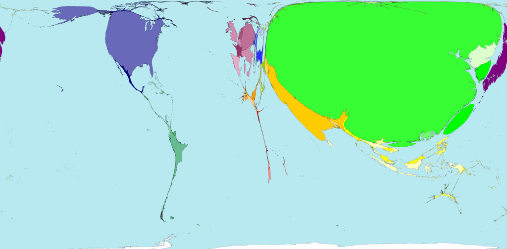 There are more shipping containers loaded and unloaded off the coasts and rivers of China, than travel to or from all other territories put together.
Nuclear power
There are more shipping containers loaded and unloaded off the coasts and rivers of China, than travel to or from all other territories put together.
Nuclear power
 European territories dominate the list of the top ten producers of nuclear electricity. In 2005, Sweden was in top place, and France second position, in terms of power generated per person living there.
Aircraft flights
European territories dominate the list of the top ten producers of nuclear electricity. In 2005, Sweden was in top place, and France second position, in terms of power generated per person living there.
Aircraft flights
 If the total distance flown by all aircraft passengers was divided equally between eveyone living in the world, we would each fly 317 kilometres a year. In fact some people fly thousands of kilometres a year, whilst others have never been in an aeroplane.
As seen on WorldMapper.
If the total distance flown by all aircraft passengers was divided equally between eveyone living in the world, we would each fly 317 kilometres a year. In fact some people fly thousands of kilometres a year, whilst others have never been in an aeroplane.
As seen on WorldMapper.
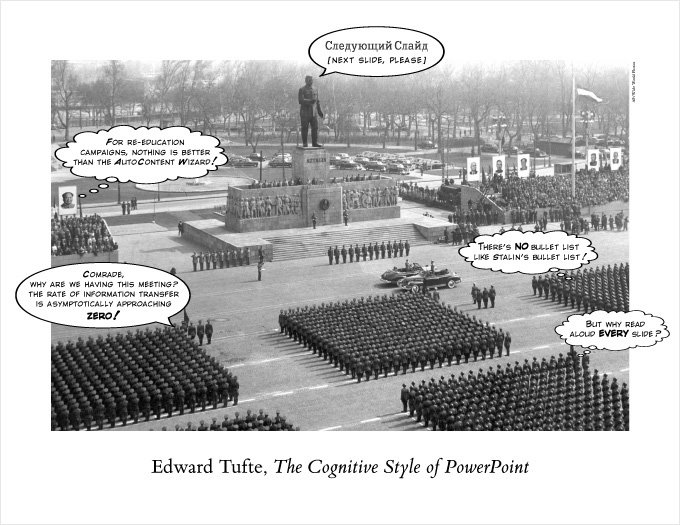 Edward Tufte doesn't need an elaborate introduction, he's simply one of the greater authors on information visualisation. Well known for his books:

