Showing posts with label usability. Show all posts
Showing posts with label usability. Show all posts
Monday, November 10, 2008

Sunday, March 16, 2008
Skybrary stand at ATC Amsterdam 2008
 ATC Global 2008 took place on 11-13 March at Amsterdam RAI and welcomed an increase in visitor numbers from 95 different countries.

Thursday, January 25, 2007
We want an interface as clean as Google's...
[designer to reference user] Could you give me an example of an interface that you really like working with to inspire me in making an interface design for your application?
[reference user to designer] Well, if you can make it as clean and simple as Google, I would surely enjoy working with it.
 Dear reader, how many times are you part of such a dialogue? Well, I must admit that I quite often find myself in the position of the designer in a similar dialogue.
Do not misunderstand: there is nothing wrong with the user's answer. I do understand what they mean with clean and simple, an interface cannot be any cleaner and simpler, because it would be an empty page and therefore not an interface any more.
The interface might appear clean and simple, but so is the functionality delivered by it. It suggests that search needs no more than entering one (maybe two words) and hit 'search'. Followed by some brilliant mechanism that understands exactly what is entered and delivers results precisely geared towards the user's expectation ordered to the user's conception of relevance.
Dear reader, how many times are you part of such a dialogue? Well, I must admit that I quite often find myself in the position of the designer in a similar dialogue.
Do not misunderstand: there is nothing wrong with the user's answer. I do understand what they mean with clean and simple, an interface cannot be any cleaner and simpler, because it would be an empty page and therefore not an interface any more.
The interface might appear clean and simple, but so is the functionality delivered by it. It suggests that search needs no more than entering one (maybe two words) and hit 'search'. Followed by some brilliant mechanism that understands exactly what is entered and delivers results precisely geared towards the user's expectation ordered to the user's conception of relevance.
Sweet dreams!
PS I do not dislike Google with some sort of passion, I actually think they are the example to anyone active in the arena of web marketing.
Monday, January 08, 2007
Faceted browsing: FAC.ETIO.US
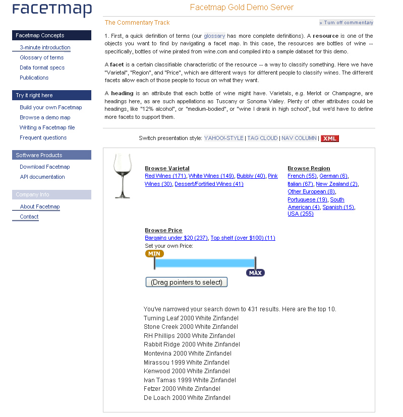
 Yet another faceted browser based on the del.icio.us API. The frames containing facets for selecting and deselecting is questionable, are these facets? What's a facet?
A facet is a group of headings which all define a certain method of classification. That is, a facet is a way in which a resource can be classified; for example, classified by colour, classified by geography, classified by subject, etc.The facet called 'Organisation' is definitely a group of headings, and they seem to classify a resource in the same way, i.e. it is a set of organisations, not other things. The trouble though with facets is that facets are close to faceted classification, which is a different kind of species, not necessarily related to facets at all. Faceted classification implies facets, but facets do not imply the usage of a faceted classification scheme for classification.
Faceted Classification: In a strict faceted classification model, a resource is classified under one heading from each facet that applies to it. A resource does not have to be classified at all in a given facet, if that facet's method of classification doesn't apply to the resource.So what we can determine is that fac.etio.us uses facets, but has no faceted classification as a scheme for classification. If that strict model were applied it may not be possible to classify an object with more than one heading from the same facet. If we would consider facets in fac.etio.us being parts of a faceted classification, then a facet would be:
A set of headings in which the assignment of one heading to a resource limits the assignment to that resource of other headings in the set.This is not the case in fac.etio.us.

Faceted browsing: DIREC.TOR
 You should know that I prefer navigating over searching in many cases, recognising is just so much easier than remembering. Looking at this tool using del.icio.us' API makes me wonder why the developer chose to use different colours for each tag selected but didn't follow that design decision throughout other parts of the interface... xanadu turned purple all over the place but in the selection box? Why?
Thursday, December 14, 2006
Essence: Designing with the user in mind
 I cannot write it down more clearly than 37signals did it for me:
About 37signals
I cannot write it down more clearly than 37signals did it for me:
About 37signals
We’re a privately-held Chicago-based company committed to building the best web-based software products possible with the least number of features necessary. Our products do less than the competition — intentionally. We’ve been in business since 1999 and love what we do.Execution is everything
We believe most software is too complex. Too many features, too many buttons, too much confusion. We build easy to use web-based products with elegant interfaces and thoughtful features. We’re focused on executing on the basics beautifully.
Friday, November 24, 2006
Tuesday, March 14, 2006
Edward Tufte
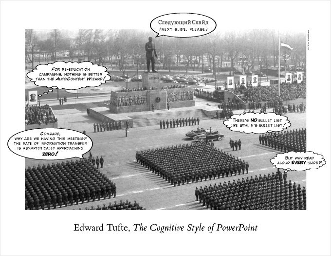 Edward Tufte doesn't need an elaborate introduction, he's simply one of the greater authors on information visualisation. Well known for his books:
- The Visual Display of Quantitative Information.
- Visual Explanations: Images and Quantities, Evidence and Narrative
- Envisioning Information
Filed in:
Infoviz,
Infographics,
Visualization,
Cognition,
Usability.
Subscribe to:
Posts (Atom)