The importance of failure
If at first you don't succeed from Ben Fry on Vimeo.
 Christian Behrens an MSc candidate of the Potsdam University of Applied Sciences (Interface Design programme) developed a useful website as a guide to Information Design Patterns.
 A modern wonder room is an option. From March 2004 until August 2005 the Museum of Communication in The Hague exhibited a modern style wonder room. The room was built by Koert van Mensvoort (lecturer at 't Sandberg Instituut) in collaboration with Studio VollaersZwart.
"It's wonderfull that we can recognise, understand and explain al the images we see, it's even more wonderfull to realise that these images are just a small amount of all the images we know. The wonder is not the room, it's the visual capability of a human being. The real wonder room is inside of our head."The last sentence reminds me of a presentation I once saw in Coronado, a peninsula in the bay of San Diego. In a fabulous hotel actually, the Hotel Del Coronado.
 Dr. Ben Carson MD was part of a conference about leadership. He just told us about his professional life as a neurosurgueon. A world renowned neurosurgeon. He told us about working on the cutting edge, under enourmous pressure, making critical decisions with hardly any time to think. One of the most impressive presentations I saw in the last 10 years. He said, at some point during his presentation, that if we were able to stimulate the right part of the brain, we would be able to remember everything we ever saw, heard, tasted, smelled, felt... I never realised that. Did you?
 They amaze me every time by their designer craftsmanship and ability to visually capture the concept of a solution without becoming overly technical...
I'd certainly would like to put them to the head slapping test of capturing my usually more than one minute elevator speech in an image that fits the back of my business card !
[designer to reference user] Could you give me an example of an interface that you really like working with to inspire me in making an interface design for your application?
[reference user to designer] Well, if you can make it as clean and simple as Google, I would surely enjoy working with it.
 Dear reader, how many times are you part of such a dialogue? Well, I must admit that I quite often find myself in the position of the designer in a similar dialogue.
Do not misunderstand: there is nothing wrong with the user's answer. I do understand what they mean with clean and simple, an interface cannot be any cleaner and simpler, because it would be an empty page and therefore not an interface any more.
The interface might appear clean and simple, but so is the functionality delivered by it. It suggests that search needs no more than entering one (maybe two words) and hit 'search'. Followed by some brilliant mechanism that understands exactly what is entered and delivers results precisely geared towards the user's expectation ordered to the user's conception of relevance.
Dear reader, how many times are you part of such a dialogue? Well, I must admit that I quite often find myself in the position of the designer in a similar dialogue.
Do not misunderstand: there is nothing wrong with the user's answer. I do understand what they mean with clean and simple, an interface cannot be any cleaner and simpler, because it would be an empty page and therefore not an interface any more.
The interface might appear clean and simple, but so is the functionality delivered by it. It suggests that search needs no more than entering one (maybe two words) and hit 'search'. Followed by some brilliant mechanism that understands exactly what is entered and delivers results precisely geared towards the user's expectation ordered to the user's conception of relevance.
 I cannot write it down more clearly than 37signals did it for me:
About 37signals
I cannot write it down more clearly than 37signals did it for me:
About 37signals
We’re a privately-held Chicago-based company committed to building the best web-based software products possible with the least number of features necessary. Our products do less than the competition — intentionally. We’ve been in business since 1999 and love what we do.Execution is everything
We believe most software is too complex. Too many features, too many buttons, too much confusion. We build easy to use web-based products with elegant interfaces and thoughtful features. We’re focused on executing on the basics beautifully.
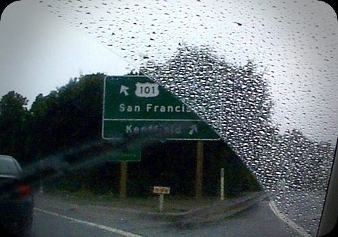 Me being interested in information visualisation, navigation and information architecture I'm lucky to be gifted with an eye for design details. I've seen websites changing their heading font (h1, h2, etc.) from Arial, to Verdana to Tahoma. For readability reasons mainly, sometimes following the pack. Reading the book Information Architecture for Designers by Peter Van Dijck loaded with examples/pictures of good and bad signs and what can be learned from them, I came up with the idea to have a look at the font used on road signs. These fonts have been carefully designed with readability and clearness as a major objective. Maybe the font used for headings would be better if we used the interstate font family?