Tuesday, November 28, 2006

World Map as means to depict statistics

Compare the following 4 maps: worldmap, container ports, nuclear power and aircraft flights.
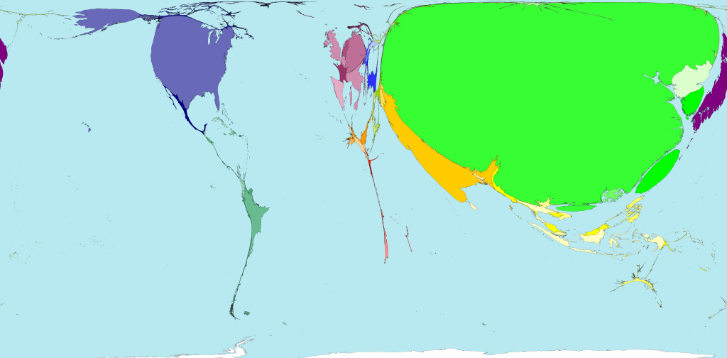
 Land area Land area 
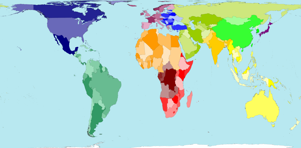
The total land area of these 200 territories is 13,056 million hectares. Divided up equally that would be 2.1 hectares for each person. A hectare is 100 metres by 100 metres. Container ports Container ports There are more shipping containers loaded and unloaded off the coasts and rivers of China, than travel to or from all other territories put together. Nuclear power Nuclear power European territories dominate the list of the top ten producers of nuclear electricity. In 2005, Sweden was in top place, and France second position, in terms of power generated per person living there. Aircraft flights Aircraft flights If the total distance flown by all aircraft passengers was divided equally between eveyone living in the world, we would each fly 317 kilometres a year. In fact some people fly thousands of kilometres a year, whilst others have never been in an aeroplane. As seen on WorldMapper.

Enterprise 2.0 and Web 2.0 as envisaged by Dion Hinchcliffe

Read more on the concept envisioned by Dion here.
The brand new report by Tim O'Reilly et al. gives some clues for organisations seeking to move forward an use web 2.0 concepts and technology in the enterprise:

Enterprise 2.0 Recommendations
  • Seek suitable enterprise process models. Look for development and operational models that suit your organization’s culture but move toward the perpetual beta. On the development side use agile, iterative approaches. On the operations side, consider best practice-centred models, such as the IT Infrastructure Library (ITIL).
  • Start with pilot projects. As with any new approach, begin with select projects and teams to learn adoption processes.
The full report can be found here.

Interesting tool to solve a lot in one go

Combines Wiki, Blog, Sharing information, and much more. Very good value for money for a starting knowledge and information management project in an organisation. Try the demo yourself

Tuesday, November 21, 2006

Monday, November 13, 2006

Yet another metadata project has started

A colleague an I will be rebuilding the corporate taxonomy for one of the largest technological research companies in The Netherlands. It's gonna be i n t e r e s t i n g.

Friday, November 10, 2006

New book on taxonomies, a practical one this time

Evert Jagerman, manager of a large team of researchers and information professionals at McKinsey&Co's Amsterdam office, published his book on creating, applying and maintaining quality taxonomies. The book is the outcome of elaborate studies and evaluations in daily practice for his Masters Thesis. He graduated from Middlesex University, London. I was one of the members of the jury that day. A job well done!

Thursday, November 09, 2006

From the archives, presentation for FIAT/IFTA

I know, I know, 2004 is some time ago, but I just got hold of the picture taken that day. I gave a speech on searching and navigation in television archives for the international federation of television archives.

Thursday, November 02, 2006

Yahoo! F o o d ?

To a European 'USA' doesn't immediately trigger the 'food'-part of the brain, to say the least. Maybe they invented repackaging, convert-to-junk food, fast food, branding food and things alike, but definitely not tasty food based on fresh ingredients and skilled cooking. Yahoo just announced Yahoo Food, a recipe search engine, which they will launch in the home market first. Probably it's a good idea advertising wise, but what kind of recipes could one actually find with it, I ask you? I'm envisaging categories like: greasiness, fattiness, estimated time of delivery, tastelessness, ... PS I'm willing to make an exception for the sunny state of California, they seem to have grasped the idea of good food, quality ingredients, slow food, drinking wine, ...

Functional usage of Maps and information projected on it: traffic info

There are a great many examples of using GoogleMaps or other map browsers to project geo-referenced or geo-tagged information. Many of them are not really functional at all, just nice to see or fun. Traphic made something really useful. You should know that The Netherlands is extremely dense traffic wise. It is extremely high on the list of inhabitants/square meter on a global scale, hence our main roads are jammed and even rail roads are jammed due to the maximum usage of it. I something goes wrong, gigantic jams occur. Their map of the main roads even shows images from the camera's installed at key crossings and entrances/exits. The rail road map shows dots which are trains, the pop-up I opened in the picture below is the yellow dot train on the left, the pop-up gives its delay information. I think it's brilliant!