Wayfinding and Navigation
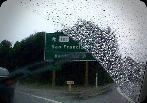 Me being interested in information visualisation, navigation and information architecture I'm lucky to be gifted with an eye for design details. I've seen websites changing their heading font (h1, h2, etc.) from Arial, to Verdana to Tahoma. For readability reasons mainly, sometimes following the pack. Reading the book Information Architecture for Designers by Peter Van Dijck loaded with examples/pictures of good and bad signs and what can be learned from them, I came up with the idea to have a look at the font used on road signs. These fonts have been carefully designed with readability and clearness as a major objective. Maybe the font used for headings would be better if we used the interstate font family?

No comments:
Post a Comment